
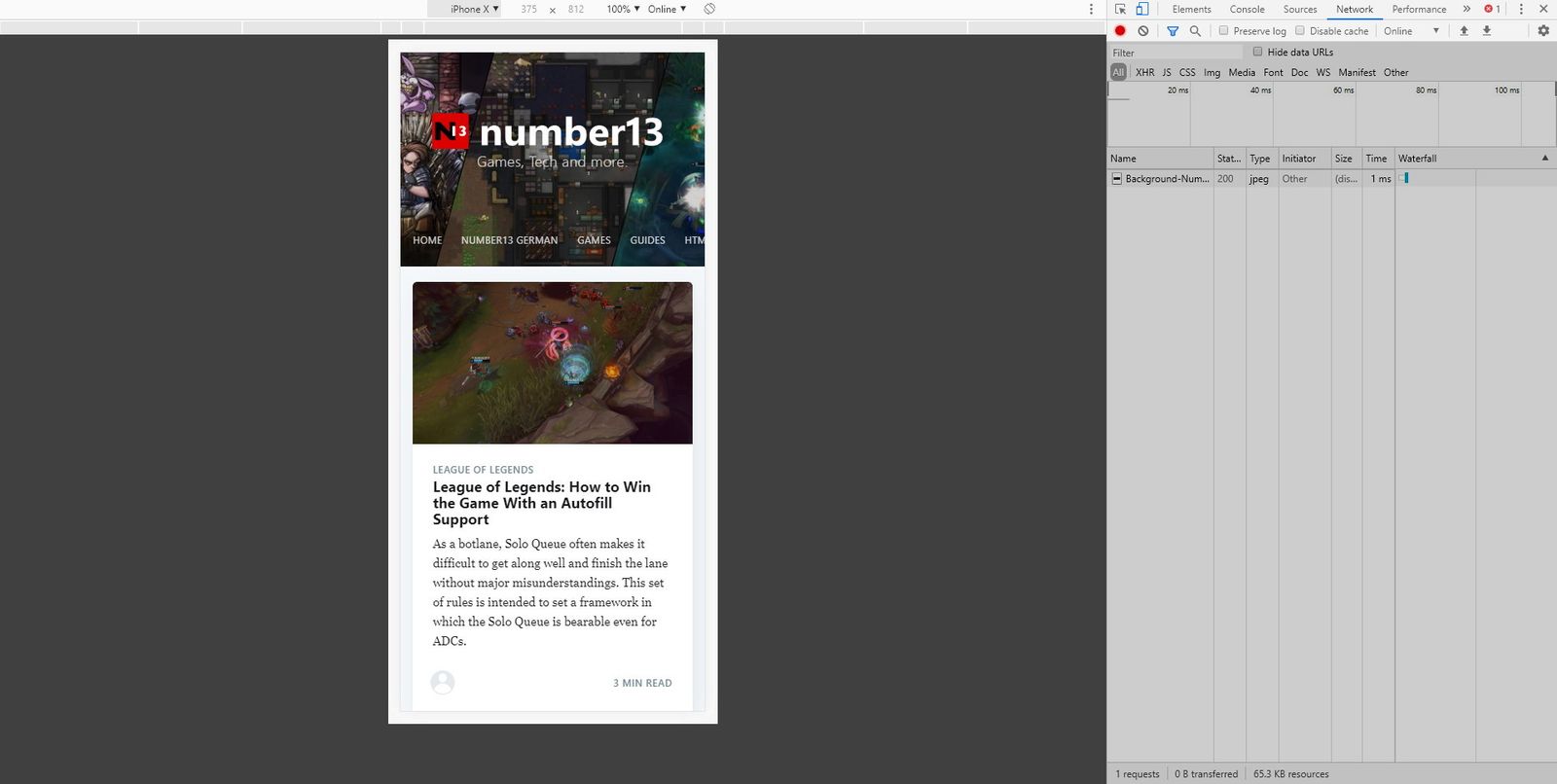
To test a page for mobile devices, all you have to do is go to the website you want and press F12 to open the Google Chrome Developer Tool.

On the right, various tabs are displayed that can help analyze the page. The source code of the page is under the tab Elements and under Network you can see, which files had to be loaded, how big they are and how long it took to load.
If you click on the small icon to the left of Elements, which is to represent a tablet and smartphone, you switch to the mobile view of the page.
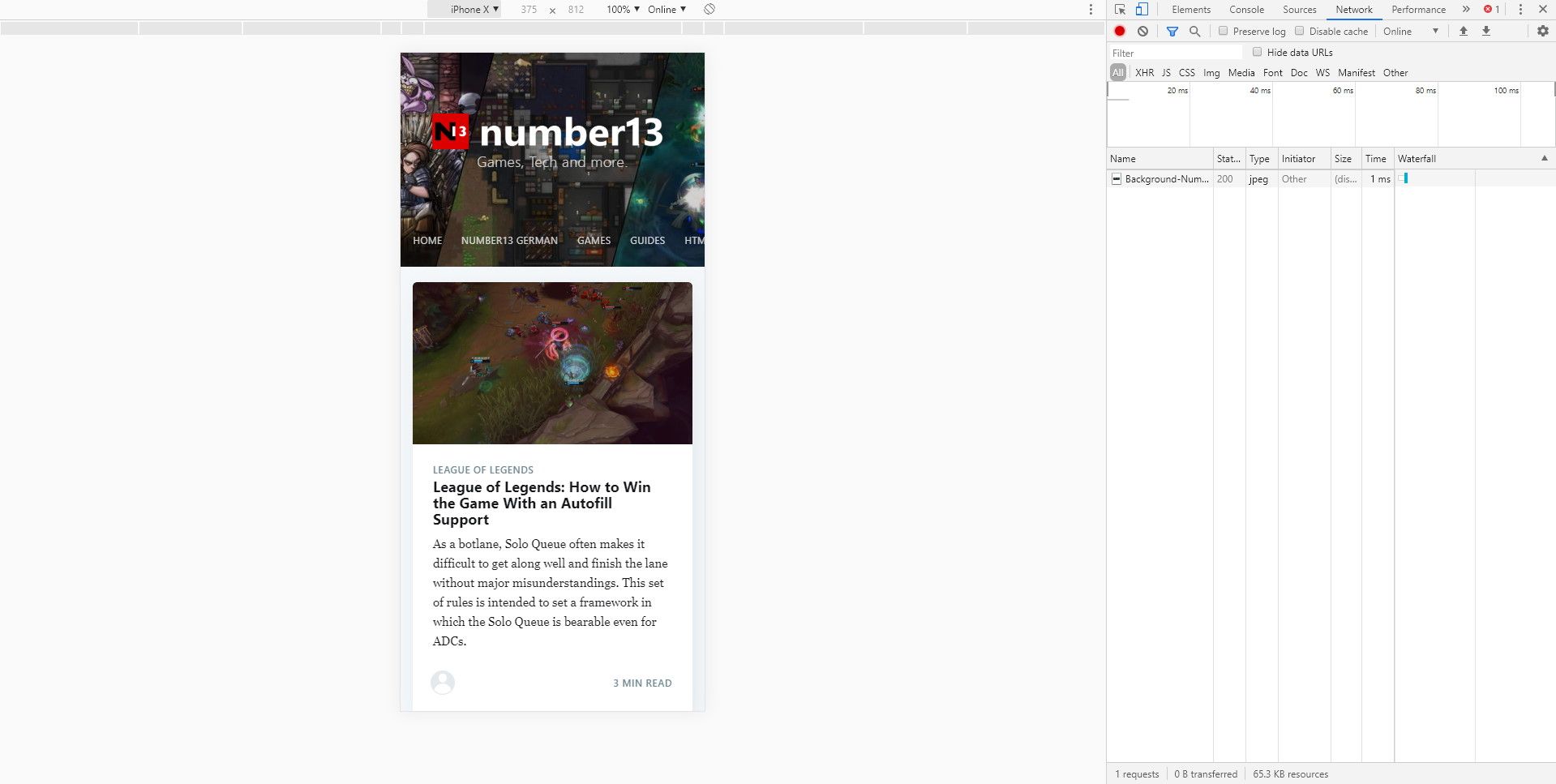
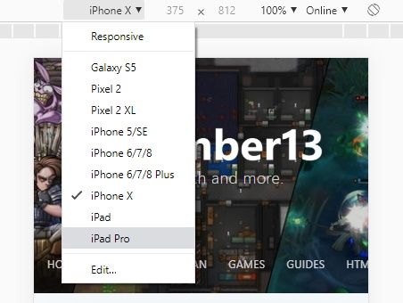
Instead of the iPhone X, many other devices can be selected aswell. Under Edit, the list of mobile devices gets even longer.
At the top right is also a button to view the whole page in landscape format. This way it is possible to empathize the complete user experience.

As you can see, the presentation differs depending on the device, as long as the website is optimized for mobile devices. While up to three posts are displayed next to each other on the computer, there is only one on the iPhone X and two posts on the iPad Pro.


If you press this button it will load Disqus-Comments. More on Disqus Privacy: Link